
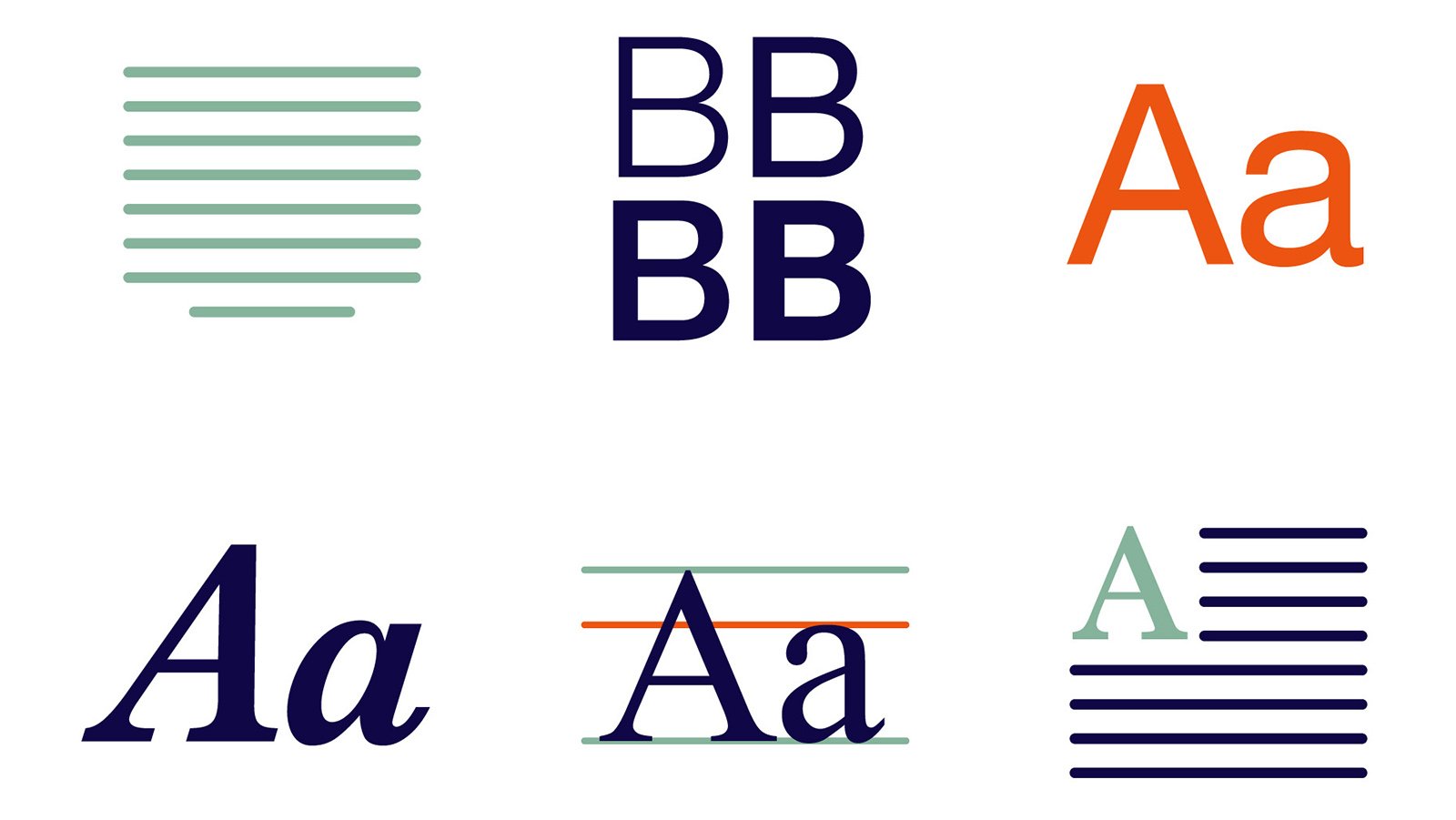
Readability is a crucial aspect of effective communication in written content. The choice of font plays a significant role in determining how easily readers can absorb information. Different fonts can either enhance or hinder readability, depending on various factors such as font style, size, spacing, and the medium in which they are used. This article explores how different fonts affect readability and how to choose the right font for various purposes.
Font Size and Readability
Font size significantly impacts readability. A font that is too small may strain the eyes, while a font that is too large can disrupt reading flow. The ideal font size depends on the medium:
- Print Materials: A font size between 10 and 12 points is generally recommended for books, newspapers, and magazines.
- Digital Content: For websites and e-books, a minimum of 16 pixels (approximately 12 points) is suggested to ensure clarity on screens.
Additionally, larger fonts are beneficial for accessibility, particularly for readers with visual impairments.
See also: Great reasons for a business organisation to book a meeting room in Phuket
The Importance of Letter and Line Spacing
Spacing between letters (kerning), words, and lines (leading) affects readability by preventing text from appearing cramped or too spread out. Proper spacing ensures that text is easy to scan and read comfortably.
- Kerning: Adjusting space between letters can improve the clarity of words, preventing misinterpretation.
- Leading: A good rule of thumb is to use line spacing of at least 1.5 times the font size to enhance readability, especially for longer paragraphs.
Contrast and Background Considerations
The contrast between the text and background is another critical factor in readability. Poor contrast can make reading difficult and strain the eyes.
- High Contrast: Black text on a white background provides the highest readability and is widely used in books and official documents.
- Low Contrast: Light-colored text on a white or similar background (e.g., yellow text on a white background) reduces readability and should be avoided.
- Dark Mode Considerations: Many digital devices offer dark mode (light text on a dark background), which can reduce eye strain in low-light environments. However, some readers may find it harder to read light text on dark backgrounds over extended periods.
Choosing the Right Font for Different Mediums
Selecting an appropriate font depends on the purpose and platform:
- Web and Digital Content: Sans-serif fonts like TT Commons Pro are preferred for readability on screens.
- Print Materials: Serif fonts like Times New Roman and Garamond are ideal for books and newspapers.
- Business and Professional Documents: Fonts like TT Fors convey professionalism and are widely accepted in formal settings.
- Marketing and Branding: Script and decorative fonts can be effective for logos and advertisements but should be used sparingly in large text blocks.
Conclusion
Different fonts affect readability in various ways, from improving reading ease to making content more visually appealing. Understanding how font style, size, spacing, and contrast impact readability helps in choosing the right font for a specific purpose. Whether for print or digital media, selecting a font that enhances clarity and comfort for readers is essential for effective communication.